Devpost
Participate in our public hackathons
Devpost for Teams
Access your company's private hackathons
Grow your developer ecosystem and promote your platform
Drive innovation, collaboration, and retention within your organization
By use case
Blog
Insights into hackathon planning and participation
Customer stories
Inspiration from peers and other industry leaders
Planning guides
Best practices for planning online and in-person hackathons
Webinars & events
Upcoming events and on-demand recordings
Help desk
Common questions and support documentation
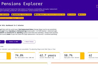
Will your pension keep its promise? Explore the triple balance of adequacy, sustainability, and equity replacement rates, retirement ages & spending, poverty 65+, and employment across countries.
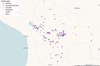
A data-driven storytelling project that transforms news into a visual narrative of femicide in Bolivia, revealing patterns of violence and restoring visibility to women whose lives were taken.
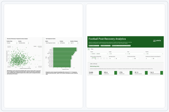
One app that turns Europe’s top-league event data into instant insights on player & team performance right after winning possession.
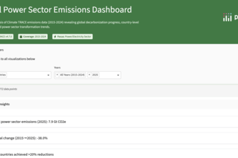
Introducing the anti-doom-scrolling app! We use Climate TRACE data to spotlight measurable climate WINS in the global power sector and key industries, translating CO2 cuts into real-world impact.
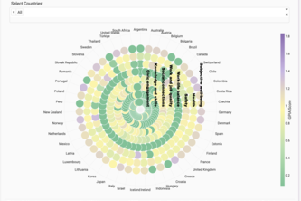
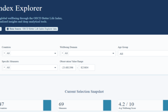
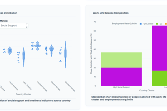
An interactive dashboard visualizing gender parity across countries, domains, and time using OECD well-being data — revealing where male or female outcomes differ and how parity evolves globally.
State-wise insights on literacy, schooling, youth, and menstrual hygiene supporting SDGs 3, 4, 5, 6. Spot gaps, compare states, and drive better outcomes for women, children, and future generation.
An interactive dashboard that animates F1's global history, compares legendary driver careers, and uncovers unique performance insights
Unlock the psychology of banking. This interactive story goes beyond demographics to decode the hidden drivers of customer financial decisions, revealing what truly motivates a 'yes' to a campaign.
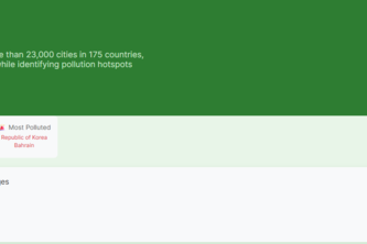
Ecobreath is a global air quality app built with Plotly Studio, visualizing pollution across 23K+ cities to raise awareness and drive action for cleaner, healthier air worldwide.
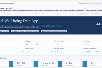
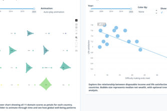
Visualizing global well-being through data — an interactive dashboard to explore how quality of life evolves across countries, generations, and social dimensions.
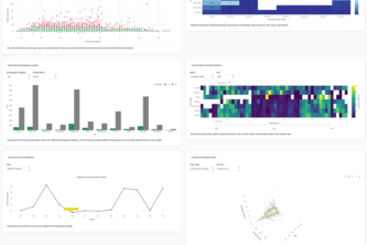
Filtering, visualization of trends along time, PCA, correlation of the OECD Wellbeing data, and data completeness graph,
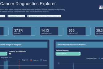
Turn complex breast biopsy data into clear, visual insights to help doctors spot patterns of benign vs malignant tumors.
Creating the best analysis of data
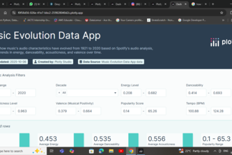
A data app that shows music evolution from 1921 to 2020 , how music changes from years to years
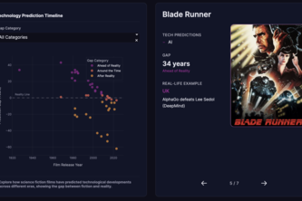
FutureFrames visualizes how science fiction films have predicted real technologies revealing which cinematic visions came true, which are still fiction, and how close movies have been to reality.
A data storytelling app that visualizes how countries balance prosperity and happiness using OECD well-being indicators — uncovering trade-offs between income, life satisfaction, and equality.
Exploring the wellness dataset
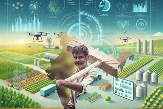
Smarter Farming Supply Chain Analytics
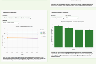
AI-powered data visualization exploring urban green space access across OECD countries with interactive maps and trend analysis
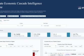
Revolutionary AI dashboard revealing hidden economic cascade patterns in climate disasters, transforming 3,000+ global events into predictive resilience intel.
Global Life Compass Navigator: Plotly Dash app for ranking/comparing 180+ countries' wellbeing data via custom weights, trade-offs, safety-health insights & forecasts. Navigate your ideal life!
See where the world’s attention goes — and what captures it next.
Cute pink dashboard, focusing on women's well-being
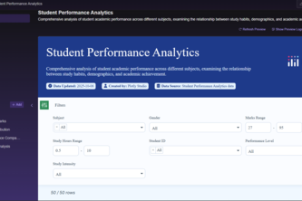
Visualizing student performance and study patterns to improve academic outcomes.
1 – 24 of 140