Devpost
Participate in our public hackathons
Devpost for Teams
Access your company's private hackathons
Grow your developer ecosystem and promote your platform
Drive innovation, collaboration, and retention within your organization
By use case
Blog
Insights into hackathon planning and participation
Customer stories
Inspiration from peers and other industry leaders
Planning guides
Best practices for planning online and in-person hackathons
Webinars & events
Upcoming events and on-demand recordings
Help desk
Common questions and support documentation
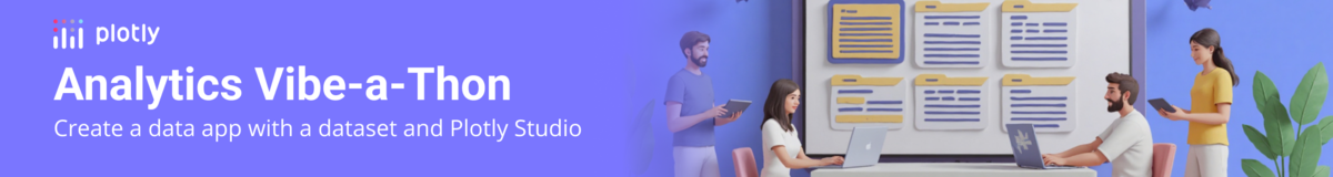
Track your spending and time, analyze your habits, and improve your day — all in one clean, interactive dashboard!
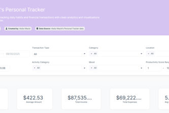
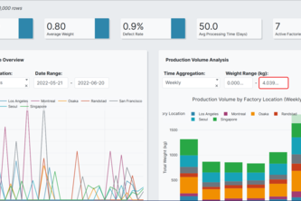
Data-driven insights for continuous improvement — visualize defects, monitor process stability, and measure real Six Sigma gains across manufacturing lines with interactive analytics.
CleanCity Insights turns Chicago’s food inspection data into an interactive story of health and safety. Explore where your neighborhood stands — from spotless kitchens to areas that need attention.
Data proves it: The chimpanzee is a cultural genius. Our app quantifies their intelligence as a tribute to Jane Goodall, who said: "The chimpanzee mind is so very like the human mind.”
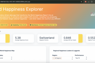
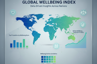
The app brings analytics to life with narrative insights, dynamic filters, and country-level comparisons to uncover what truly makes nations happy.
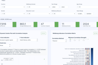
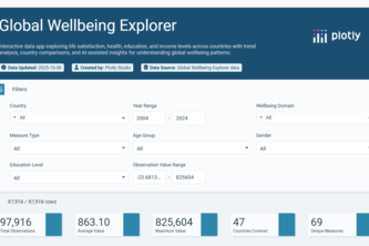
WellBeing360 is an interactive Plotly Studio dashboard that provides a 360-degree analytical view of global well-being indicators.
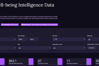
Comprehensive analysis of well-being indicators across OECD countries, examining various measures of quality of life including health, safety, education, and social connections.
Interactive dashboard analyzing quality of life across 47 countries and 11 wellbeing dimensions. Compare, explore trends, demographics, and top performers.
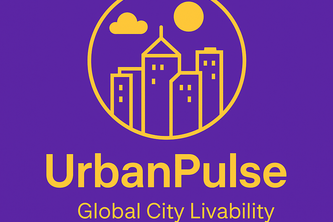
UrbanPulse is an interactive data app ranking 60 global cities across 9+ livability factors. Users can adjust weights or choose presets to personalize rankings.
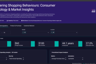
Decode the psychology behind every purchase: an interactive Plotly app reveals why, when, and how customers buy, turning raw shopping data into actionable insights for smarter retail strategies.
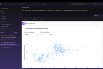
I built this app to make studying abroad simpler, compare tuition, living costs & scholarships in one place. More affordable study-abroad choices with just a few clicks.
Discover surprising correlations between education, health, safety, income and life satisfaction indicators through dynamic visualizations and country-level insights.
Sentinel is a predictive maintenance platform that analyzes real-time sensor data from factory machinery.
Explore how happiness, health, and wealth shape lives across the globe — an interactive data story revealing what truly drives human wellbeing.
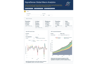
Professional analytics app for economists and asset managers to monitor long-term global macroeconomic indicators across growth, inflation, monetary policy, labor markets, trade, and fiscal metrics.
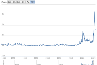
This project uses the agentic AI tools of Plotly to get information from the Economic Policy Uncertainty index. The index is a way to measure people's uncertainty of the future using NLP techniques.
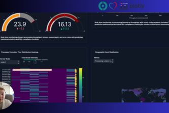
Unlocking near real-time event processing analytics full potential with Plotly Studio
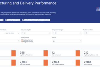
A machine learning-powered analytics app that tracks manufacturing and predicts delivery times, highlights trends and delays, and helps improve supply chain decisions across project sites.
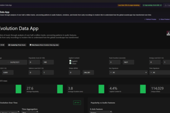
Visualizing a century of music — where data meets rhythm and history sings.
The 'OECD Well-being Intelligence App' uses a striking purple theme, 6 analytical charts, and 8 global filters to deliver deep 'Purple Intelligence' into health, safety, and employment disparity.
An interactive, gamified dashboard that lets users explore how global well-being changes when they make policy or lifestyle choices — using real OECD data.
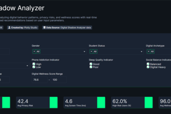
Digital Shadow Analyzer: Enter your phone habits → instantly see your predicted personality, privacy risk & wellness scores. Shows what companies know about you + how to protect yourself.
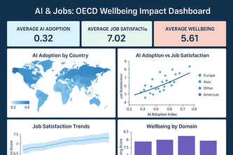
Interactive dashboard analyzing AI’s impact on jobs, income, work-life balance, and wellbeing across OECD countries using AI-driven insights.
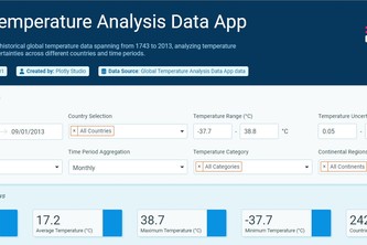
See the planet's fever chart come to life—interactive climate storytelling that makes centuries of global warming visually undeniable.
25 – 48 of 140