Devpost
Participate in our public hackathons
Devpost for Teams
Access your company's private hackathons
Grow your developer ecosystem and promote your platform
Drive innovation, collaboration, and retention within your organization
By use case
Blog
Insights into hackathon planning and participation
Customer stories
Inspiration from peers and other industry leaders
Planning guides
Best practices for planning online and in-person hackathons
Webinars & events
Upcoming events and on-demand recordings
Help desk
Common questions and support documentation
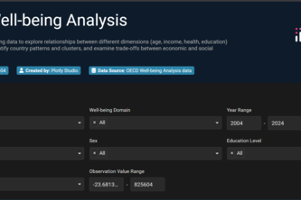
“I built a Plotly app that makes OECD well-being data interactive, showing patterns and country comparisons with advanced charts.”
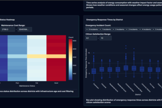
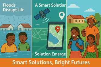
Smart City Infrastructure Monitor gives city leaders real-time insights, predictive alerts, and data-driven decisions—cutting failures, saving costs, and improving lives.
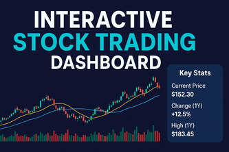
Interactive Stock Trading Dashboard: explore historical stock data through candlesticks, moving averages, RSI, and volume indicators and filter by ticker, date range, and technical indicators.
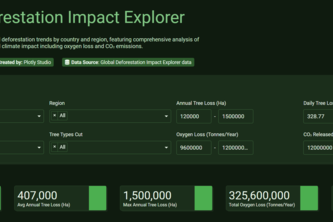
An interactive app that shows global deforestation and how many trees we lose,why and its impact on oxygen and CO2 and using data to raise awareness and protect nature.
Smart Solutions,Brighter Futures
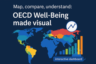
11 dimensions. 40+ countries. One interactive dashboard.
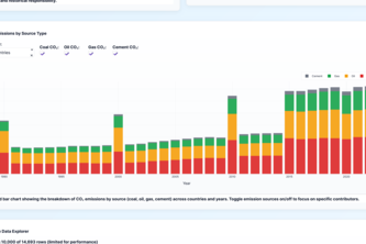
Vibe analytics of co2 dataset through plotly
Invest Smart, Spot Tomorrow’s Winners Today.
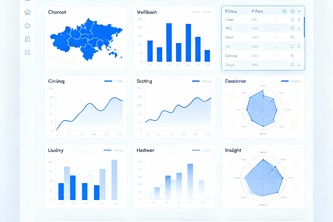
Empowering users to visualize, understand, and close the wellbeing gap.
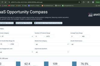
This dashboard is your compass for the crowded SaaS market. It analyzes product launch data to pinpoint high-growth, low-competition niches, enabling smarter, data-driven investment decisions.
the AI model compass, charting the course for your AI strategy.
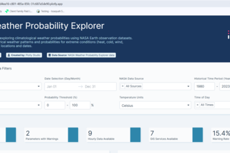
DataSky Protype App uses NASA Earth observation sample data to calculate the likelihood of extreme heat, rain, wind, or uncomfortable weather.
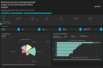
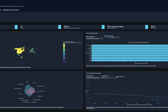
Well-being Anatomy is an interactive platform using OECD data to explore global quality of life through visualizations, comparisons, and demographic insights.
Find your ideal country. This interactive app lets you explore global well-being and discover nations that excel in the quality-of-life areas you care about most.
OECD Well-being: Track the World's Progress, Domain by Domain.
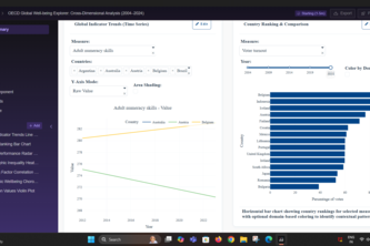
Let's explore OECD Wellbeing Data
An interactive Plotly Dash app that brings trust to life by visualizing Mint → Verify → Attest → Seal events as a living graph of verifiable identity.
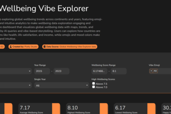
Data meets vibes! 📊💫 Explore global wellbeing like never before with our interactive dashboard.
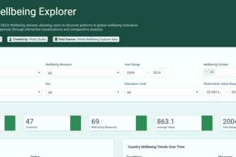
This data app explores the OECD Wellbeing dataset, allowing users to discover patterns in global wellbeing indicators across countries and time periods.
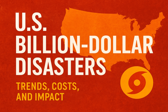
Explore 40 years of U.S. billion-dollar disasters.
Countries exaggerate happiness. Google at 4 AM reveals the truth. An interactive data dive exposing the gap between reported wellbeing and real midnight distress.
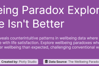
An interactive tool exploring why success doesn't always equal happiness. Uncover the surprising paradoxes hidden in global wellbeing data and challenge conventional wisdom.
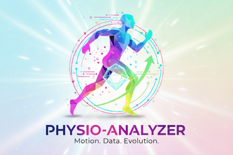
Physio Analyzer analyzes thousands of physio datasets to build your perfect workout plan. Visualize your progress and compare results with powerful, data-driven insights. Get smarter results, faster.
Real-time monitoring and analysis of critical patient vital signs including heart rate, oxygen levels, and temperature to support healthcare professionals in emergency and routine care situations .
97 – 120 of 140