Devpost
Participate in our public hackathons
Devpost for Teams
Access your company's private hackathons
Grow your developer ecosystem and promote your platform
Drive innovation, collaboration, and retention within your organization
By use case
Blog
Insights into hackathon planning and participation
Customer stories
Inspiration from peers and other industry leaders
Planning guides
Best practices for planning online and in-person hackathons
Webinars & events
Upcoming events and on-demand recordings
Help desk
Common questions and support documentation
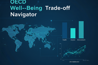
Explore how life satisfaction connects with income, health, and work across OECD countries through interactive analytics and AI-powered visualization built in Plotly Studio.
Rare diseases in children - symptoms , causes , treatment and helpline number
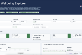
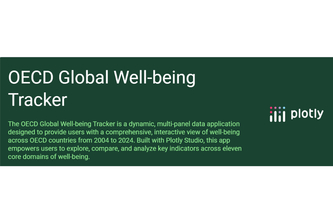
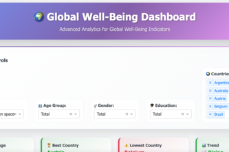
An interactive dashboard that reveals how countries thrive across wellbeing dimensions;compare, explore, and spotlight strengths and weaknesses worldwide.
Optimizing accessibility investments by prioritizing stations with the highest ridership, failures, and community vulnerability.
Explore how the world lives and feels — one interactive bubble at a time. 🌍✨
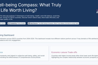
For decades, we've measured a nation's success by a single number: GDP. But does economic growth equal a good life?
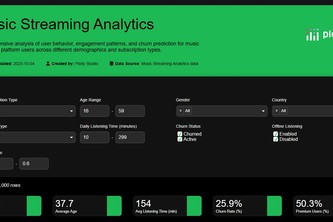
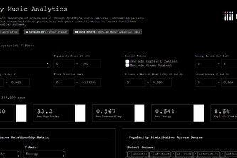
My Spotify-powered behavioral analytics pinpoints listener shifts via time-series analysis, enabling proactive strategy to reduce skip rates and mitigate churn.
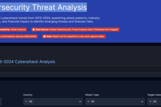
Comprehensive analysis of global cyberattacks, examining attack patterns, industry targeting, geographic distribution, and financial impact to identify emerging threats and forecast risks.
Visualizing how much of the world has access to nature.
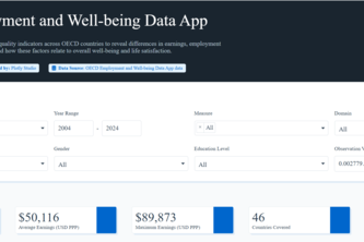
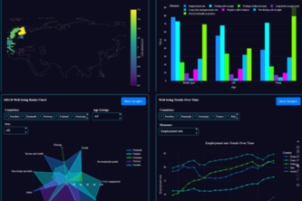
A data app offering interactive visualizations of OECD employment and well-being metrics to compare job quality, gender gaps, and life satisfaction.
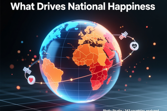
Interactive dashboard analyzing 143 countries to reveal what drives national happiness. Features derived metrics and multi-dimensional visualization showing social capital matters more than GDP.
Interactive dashboard to explore global well-being trends, country comparisons, and AI-generated insights.
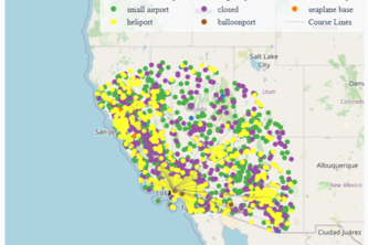
An interactive dashboard to explore airports in the United States by type and elevation discover extreme and remote airports with ease.
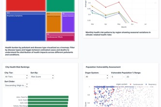
AI-powered dashboard predicts and maps disease risk using climate and health data, giving real-time alerts to help communities act early and protect public health effectively.
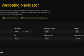
Explore global happiness with natural language — charts, correlations, and policy suggestions powered by Plotly Studio AI.
Decode Spotify data. Visualize audio features, correlate with popularity, and perform advanced genre analysis to understand the science behind hit songs.
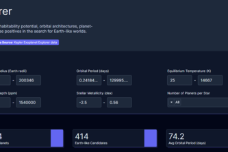
OrbitLens is an interactive app visualizing NASA’s exoplanet data & potential new planets. Explore orbital patterns, planetary traits, and discovery trends via dynamic charts and AI-assisted insights.
Ready to be amazed at how much can now be done using Plotly to squeeze out every bit of information from your data — all in a time frame that almost feels like a joke?
Discover the plants that shape where you live: learn, explore, and connect with local biodiversity with this plant explorer dashboard.
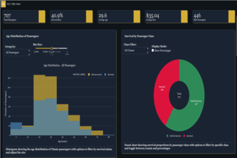
Titanic Survival Analytics: Explore historical passenger data, uncover survival patterns, and leverage predictive modeling for actionable insights
HealthScope: A vibrant, modern dashboard that visualizes health data to reveal patterns in age, risk, and disease. Designed for clarity, insight, and smarter healthcare decisions.
NBA Team Performance Analytics is an interactive data exploration project, designed to help users visualize and understand team performance across seasons for fan, coach, or analyst.
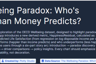
“The Wellbeing Paradox: Revealing who’s happier (or less happy) than money predicts.”
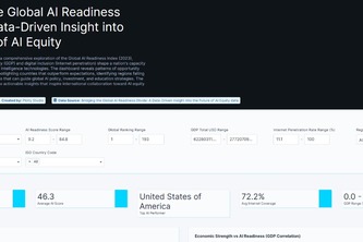
Bridging the AI Readiness Divide visualizes how GDP and digital access shape nations’ AI adoption, revealing gaps, top performers, and insights for a more inclusive AI future.
49 – 72 of 140